Summary: Building a repository of good report components helps you quickly assemble reports that work. Typical things to watch for are: Opening statements, summary sections, key takeaways, useful dimensions and metrics, and recommendations.
As an analyst, it’s your job to look at data and then summarize it for managers and end users.
What Does a Report Look Like?
 For some groups, a report is an email. For others it’s a written memo. Sometimes there’s a formal structure. Other times it’s freeform. Regardless, you need to narrow down what a report looks like. Some of the key sections I have used are:
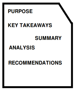
- Purpose: Why is this report even being written? Why does the reader care?
- Summary: High-level wrap-up of the data. Normally a table of data or maybe a chart.
- Key Takeaways: What are the most important facts that the reader needs to know? This section typically pulls key insights from your analysis section and introduces your core recommendation(s).
- Analysis: The dimensions and metrics that you are using to explore and present the core facts of your report.
- Recommendations: After reading this report, what should the next actions be? They should be directly related to what you discussed in the body of your report.
Notice how it almost follows an inverted-pyramid. The most important things are at the front. That way, if your reader only gets through the first page, they’ve got the gist.
What Reports Do Managers Like?
When you notice a report getting shared (in a positive way) or some numbers are consistently referenced
Things to look for:
- Does anyone important like this report?
- Does the report contain numbers that are consistently referenced?
- Is it quarterly sales? Is it cart abandonment? Is it gross profit?
- Was the report shared with you (i.e. are people sharing the report)?
- Did some action get taken due to the recommendations?
What Reports Reveal Important Information?
As part of a swipe-file, you might find reports the reveal important insights. I like to save these reports and occasionally re-read through them. Especially when the content is technically difficult or counter-intuitive.
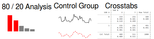
If the report is actually useful, you can use similar metrics / calculations in your own reports. For example, if you often see good reports showing the difference between the top 20% and the bottom 80% (80/20 analysis), you should use that sort of split in your report as well. At least explore the option.
This is very similar to the concepts behind creating a cheat sheet. The minor difference is that these sorts of reports are specialized and most likely not updated very often (and hopefully the results would change slowly).
Reusing these breakdowns of important statistics helps build your credibility. There is a two-fold impact: 1. Using oft-repeated dimensions+metrics shows that you speak the language of your company and 2. Those who created those breakdowns will be happy to see their “invention” spreading around.
Personally, the biggest challenge is finding out what dimensions are interesting to your managers and your manger’s manager. Outside of having these sorts of metrics given to you, it’s important to ask for other people’s opinions! It’s amazing how much people will give if you just ask.
How are Comparisons Made?
All marketing is relative. It’s important to show the value of your efforts even when it’s not a controlled test.
- Controlled Experiments: This is ideal.
- Consistent Baseline Group: Is there one group that is the gold standard? For example, if you compare a test group, without doing a holdout, you could still compare them to the top groups.
- Self-Selecting Control Groups: Different product lines, different geographies.
- Year-over-Year Differences: Perhaps more generally, is there a consistent time period that you could compare.
- Holding Variables “Equal”: Does your organization respond well to putting variables in a table and showing the ratios?
[table]
Metric,Top 20%, Bottom 80%,
Had a Sales Visit, 90%, 20%,
Bought Class X, 60%, 15%,
Active Last year, 91%, 37%
[/table]
- Incremental value: In any of the above breakdowns, do you need to report the difference between the groups or index it against one group?
- e.g. Customers with a sales visit a 10x more valuable than those without.
Putting it Together
You should now be able to identify what you need to put into your swipe file. It all comes down to knowing…
- How are reports presented to leaders who make decisions?
- What resonates with managers?
- What sort of variables and metrics are oft-repeated and appreciated?
- How do you make a comparison at your organization?
Following this pattern, you should quickly be able to quickly find good reports, improve your reports and memos, and ignore reports that don’t add any value.